Physical Address
304 North Cardinal St.
Dorchester Center, MA 02124
Physical Address
304 North Cardinal St.
Dorchester Center, MA 02124

In today’s digital world, reactive web design has changed how we use online platforms. Your online experience needs to work well on all devices, from phones to big desktops. Reactive web design makes websites that change based on how you use them and what device you’re on.
Web developers use new tech to make websites that look good and work smoothly. They aim to make your online experience feel natural and easy, no matter the screen size or device.
Modern websites need smart designs that guess what users want. With reactive design, websites become more fun, easy to use, and work well on many devices.
Web design has changed a lot, moving from fixed layouts to flexible ones that work on all devices. This shift to reactive web design is a big deal for online experiences.
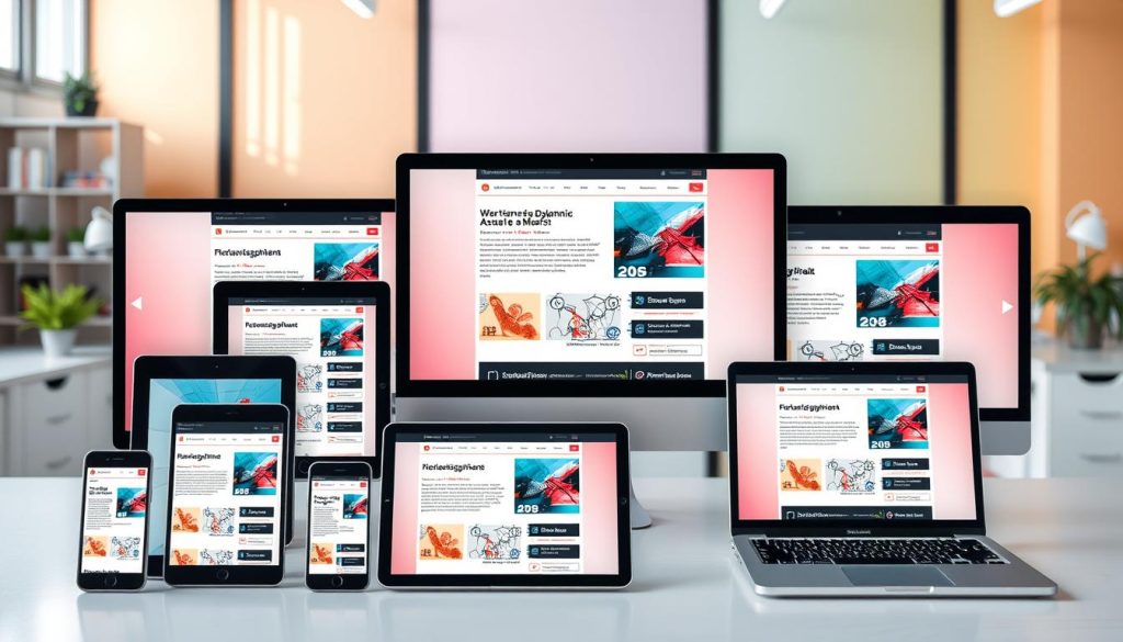
Reactive web design goes beyond old ways by focusing on all devices. It makes sure websites work well on any screen size or device.
The move from static to dynamic web design was a big journey:
Reactive web design has key parts:
“Design is not just what it looks like and feels like. Design is how it works.” – Steve Jobs
Using fluid layouts and strategies for all devices makes websites better. They:
Web design has changed a lot in recent years. Now, we have reactive web design, which makes digital experiences more dynamic. Unlike traditional responsive design, which only changes layout, reactive design reacts to user actions in real time.
Here are the main differences between reactive web design and responsive design:
“Reactive design isn’t just about screen size—it’s about creating living, breathing digital experiences.”
Traditional responsive design uses fixed rules for layout. But reactive web design makes websites more flexible and smart. It changes based on how users act, what devices they use, and what they need.
When choosing between reactive and responsive design, think about your project’s needs. Look at:
Knowing these differences helps you choose the best design for your website.
To make web experiences dynamic, developers need a powerful toolkit. This toolkit helps build sites that work well on all devices. The right tech makes websites better for users, no matter the device.
Today’s web development needs strong frameworks and libraries. These tools make complex tasks easier and ensure users have a smooth experience.
Many top frameworks help create dynamic web sites:
Special tools help make sites work on all devices:
Testing is key to ensure sites work on all devices:
| Platform | Key Features | Cross-Device Support |
|---|---|---|
| Selenium | Automated browser testing | Extensive device coverage |
| Cypress | Real-time reloading | Modern web application testing |
| BrowserStack | Cloud-based testing | Multiple device simulation |
“The right tools can transform complex development challenges into elegant solutions.” – Web Development Experts
Choosing the right tools and technologies is crucial. They help create web sites that work well on all devices and platforms.
The mobile-first approach has changed web design. It makes developers start with mobile design. This ensures websites work well on all screens.

Resolution independent design is key for smooth user experiences. Flexible layouts make websites fit any device, no matter the screen size or pixel density.
“Design for mobile first, then scale up – not the other way around.” – Responsive Design Experts
Important things to consider in mobile-first reactive development include:
| Technique | Implementation |
|---|---|
| Fluid Grids | Percentage-based layouts |
| Flexible Images | Max-width: 100% scaling |
| Media Queries | Adaptive breakpoint strategies |
Using these techniques, you’ll make websites that are truly responsive. They will work well on all devices, focusing on the user.
Fluid layouts are key in modern web design. They make websites work well on all devices and screen sizes. By using flexible grid systems, you can make websites look great on phones, tablets, and computers.
Understanding the basics of fluid layouts is crucial for creating dynamic web sites. These layouts let content move and change size as needed. This gets rid of the old fixed-width problems that made designs stiff.
Grid systems are the backbone of fluid layouts. They help you:
Responsive design needs careful attention to the viewport. Your fluid layouts must adjust to:
Good spacing is key to making fluid layouts look nice. Use percentages for margins and paddings. This makes design elements grow or shrink as needed.
“Fluid layouts are not just about responsiveness, but about creating seamless user experiences across all devices.” – Web Design Experts
Professional web developers know fluid layouts are more than a trend. They’re a basic part of modern digital design.

Media queries are key to making web designs work on all devices. They let you create layouts that change smartly based on screen size and device type.
“Great design is not just about appearance, but about how intelligently your content adapts to different viewing environments.” – Design Expert
Choosing the right breakpoints is crucial. These points decide how your design changes as screen sizes change.
Your media queries should do more than just adjust layout. Think about improving typography, image sizes, and interactive parts for better user experiences.
Advanced media query strategies include:
Dynamic content loading, conditional styling, and adaptive navigation. These make user interaction better on all devices.
Web design has grown to make experiences work well on many digital platforms. Progressive enhancement is a key strategy for making strong web apps that fit different user settings.
Progressive enhancement aims to give a basic, working experience to all users. It adds extra features for better browsers and devices. This way, your site stays open and works for everyone.
Using progressive enhancement needs careful planning. Important steps include:
Today’s web development uses smart feature detection. These methods check what a user’s browser can do and show the right content.
“Design for the lowest common denominator, then enhance.” – Web Design Principle
Good fallback strategies make sure users with old browsers can still see main content. This might mean offering simpler layouts, easier interactions, or basic functions that work everywhere.
By going for progressive enhancement, you make web experiences that are welcoming, strong, and fit the changing digital world.

Web designers face a big challenge today: making sure websites work well on all devices. Your site needs to look and feel great on phones, tablets, desktops, and all screen sizes. The digital world now expects websites to change and adapt for each device.
To test cross-device compatibility, you need a few key steps:
Pro developers use strong testing methods to find any problems. Responsive design frameworks like Bootstrap and Foundation help start making websites that work on all devices.
“The key to successful cross-device compatibility is understanding user experience across different platforms and screen sizes.” – Web Design Expert
Here’s what your testing plan should include:
Tools like BrowserStack, Sauce Labs, and Google Chrome DevTools are great for testing. They let developers test on many devices and find issues before your site goes live.
Creating a website that works on all devices is a big task. Your site’s speed and how it responds are key to keeping users happy and ranking well in search engines. Today’s web development needs fast loading times on every device.
To make your site load faster, try these:
Managing resources well is key for a site that works on all devices. Here’s how to improve:
Smart caching can make your site faster on all platforms:
| Caching Type | Performance Impact | Device Compatibility |
|---|---|---|
| Browser Caching | High | Universal |
| Service Worker Caching | Very High | Modern Browsers |
| CDN Caching | Excellent | Global |
“Performance optimization is not a destination, but a continuous journey of refinement.” – Web Performance Expert
By using these strategies, you’ll make a website that’s fast, responsive, and works great on all devices. It will give users a top-notch experience.

Adaptive content is a key to making web experiences personal for everyone, no matter the device or situation. Your strategy needs to move beyond the old ways of doing things. It’s about making digital interactions truly dynamic.
“Adaptive content is not just about responsive design, it’s about intelligent content delivery.” – Digital Experience Expert
To make adaptive content work, focus on a few important points:
Knowing how users behave is crucial for creating adaptive content. You need to see how people use your digital spaces. Then, make your content adjust to their needs smoothly.
| Content Strategy Element | Key Considerations |
|---|---|
| User Context Detection | Device type, screen size, location, browsing history |
| Content Flexibility | Modular design, reusable components |
| Personalization Triggers | User preferences, interaction patterns |
Creating adaptive content needs advanced tech skills and smart planning. Your aim is to make a web experience that’s always ready for users, before they even ask for it.
With adaptive content, you turn static websites into smart, interactive experiences. These experiences engage users on all devices.
Web design is always changing, needing new strategies to stay ahead. It’s important to be ready for new tech by using design principles that work for all devices.
Designing for the future means knowing about new tech and making your web flexible. Your aim is to make experiences that go beyond what devices can do now.
Scalable design means thinking about more than just today’s screens. You need plans for:
“The most successful web designs are those that can seamlessly adapt to unknown future technologies.” – Design Innovation Institute
As display tech gets more varied, making designs that work on all devices is key. Your web should look great and work well on everything from smartwatches to 8K monitors.
| Strategy | Key Benefit |
|---|---|
| Vector Graphics | Infinite scalability |
| Flexible Grid Systems | Responsive across devices |
| CSS Grid Layouts | Dynamic content placement |
By using these strategies, you’ll create web experiences that are not just current but also ready for the future.
Reactive web design is a new way to make digital experiences that really meet user needs. It uses smart strategies to make websites work well on all devices and sizes. This approach goes beyond just making websites look good on different screens.
Learning about reactive web design is an ongoing process. You’ll need to keep up with new technologies and methods. These tools help you make websites that look great and work even better.
As the web changes, your skills in reactive web design will be key. You’ll learn to make websites that are easy to use and work well. Remember, this is a journey of constant improvement and creativity.
The future of web development is all about making websites that understand and meet user needs. By using reactive web design, you’ll be ready to create amazing websites. These websites will not only work well but also connect with users in a special way.